I recently changed came across the awesome worlds of fonts, because I got tired of the default font in my email-client . I had been using Calibri for the last 5 years, and before that the default Times New Roman or whatever, with-out ever realising what I using.
All of a sudden, a few weeks ago, Calibro looked..... old. I started looking for a few new fonts, and came across this awesome article about proxima nova
This post is really a world-wind tour through the fonts. The linked articles contain all the meaty details.
Basics of Fonts
I got interested in what are the basics of fonts:
- Most fonts are either Serif or Sans Serif.
- Here we see that Sans fonts, one of the oldests ones, have "a little decorative stroke that extends from letters. It can be in the form of a tail, sharp or blunt, decorative or plain", hence it being an oldy-looking font. Classical examples are Times New Roman
- On the other hand, Sans Serif, lack those funny extenders (hence the word "sans") and are cleaner, more modern looking fonts. Since 2007, Microsoft replaced Times New Roman and Arial with Calibri, hence it being such a common font.
- There are more catergories of fonts, one being geometric
- Of the most recent popular fonts, we see Helvetica and Proxima Nova
- Helvetica is actually quite old, being released in 1957, compared to Arial (1982) and Calibri (2007). Times New Roman dates back to 1932.
- For the history of fonts, check out the technical differences between 'typeface' and 'font'
- This is a nice listings of fonts, compatibilites and history
This is a really sweet and short version of the basics of typography
Influence
Considering how digital typefaces came about, their use was influenced by desktop computers, and specifically Operating Systems that chose certain fonts. Fonts needed to be installed on the PC to be used, and those that shipped with the OS turned out to be the ones we used.
A lot of the digital fonts that we see have been influenced by Operating Systems and programs (Word, etc) that had default fonts, and agreements beween major companies. Steve Jobs has had a huge influence, because of the classes he attended that influenced the design and fonts in the Mac.
The biggest influencers, atleast on desktop computing, kinda before the web age, was due to Microsoft, Apple, Adobe, and their agreements on how to store fonts (TrueType and OpenType)
When we talk about paid vs free fonts, some were bought or licensed by these big companies, which led to its wide-spread use. Kinda similiar to how Windows images where bought and made famous.
In the desktop world, one the biggest issues was compatbility. So since fonts need to be either shipped ot installed in the OS, and if you had a document that used a font that was not installed on another PC, it would then be rendered using another font. Some document types that embed the fonts, like PDF, help to prevent this. In the mobile world, they too influenced fonts and their usage, like Android's Roboto.
Web fonts
Then as the Web emerged, there came the issue of font compatibilty on web sites. There are issues of browser, and desktop vs mobile compatibilty. To help solve this, there are places that hosts fonts, like Google Fonts, that can be specified in your CSS.
There is also a more recent way to use System Fonts for mobile web designs - the fonts that are part of the mobile UI OS, like Roboto on Android
Costs
A lot of fonts are'nt free. They take years to design. You need to see which you are allowed to use, for commercial or other reasons.
Some technical definitions
- Typface vs font: A typeface is a set of fonts in the same family, so a font is a subset of a typeface. A font is what you use, a typeface is what you see.
- A font is implemented as a digital data file containing a set of graphically related glyphs, characters, or symbols
- Fonts are stored in files like TTF or OTF
- A font family or typeface refers to the collection of related fonts across styles and sizes.
- Typography is the art and technique of arranging type to make written language legible, readable, and appealing when displayed
- In typography, a glyph is the specific shape, design, or representation of a character. It is a particular graphical representation, in a particular typeface.
There are also the following techniques used to display characters or glyphs:
- A bitmap font contains a grid of dots known as pixels forming an image of each glyph in each face and size.
- Outline fonts (also known as vector fonts) use drawing instructions or mathematical formulæ to describe each glyph.
- Stroke fonts use a series of specified lines (for the glyph's border) and additional information to define the profile, or size and shape of the line in a specific face and size, which together describe the appearance of the glyph.
- A Unicode font (also known as UCS font and Unicode typeface) is a computer font (like the above 3) that contains a wide range of characters, letters, digits, glyphs, etc., which are collectively mapped into the standard Universal Character Set, derived from many different languages and scripts from around the world. Unlike most conventional computer fonts, which are specific to a particular language or legacy character encoding and contain only a small subset of the UCS characters, these fonts attempt to include many thousands of glyphs, so that they can be used as a single typeface across multilingual documents.
I also thought I will mention the tie in to Unicode, by mentioning this awesome article by Joel, which goes over "the mysterious world of character sets, encodings, Unicode, and all that stuff"
- For good old unaccented English letters, we had a code for them called ASCII which was able to represent every character using a number between 32 and 127. Space was 32, the letter “A” was 65, etc, which was stored in 7 bits.
- Because bytes has 8 bits, many people started using that extra bit to store their own things, which eventually got codified into the ANSI standard.
- Unicode was a brave effort to create a single character set that included every reasonable writing system on the planet.
- In Unicode, a letter maps to something called a code point. In Unicode, the letter A is a platonic ideal. This platonic A is different than B, and different from a, but the same as A and A and A. The idea that A in a Times New Roman font is the same character as the A in a Helvetica font, but different from “a” in lower case, does not seem very controversial, but in some languages just figuring out what a letter is can cause controversy. Is the German letter ß a real letter or just a fancy way of writing ss? If a letter’s shape changes at the end of the word, is that a different letter? Hebrew says yes, Arabic says no. Anyway, the smart people at the Unicode consortium have been figuring this out for the last decade or so, accompanied by a great deal of highly political debate, and you don’t have to worry about it. They’ve figured it all out already.
- Every platonic letter in every alphabet is assigned a magic number by the Unicode consortium which is written like this: U+0639. This magic number is called a code point. The U+ means “Unicode” and the numbers are hexadecimal. U+0639 is the Arabic letter Ain. The English letter A would be U+0041. You can find them all using the charmap utility on Windows 2000/XP or visiting the Unicode web site.
- Encodings, like UTF-8 or UTF-8, was another system for storing your string of Unicode code points, those magic U+ numbers, in memory using 8 bit bytes.
My fonts
So after all that...., here is what I am using now:
I thought this is a nice way to close this article off:
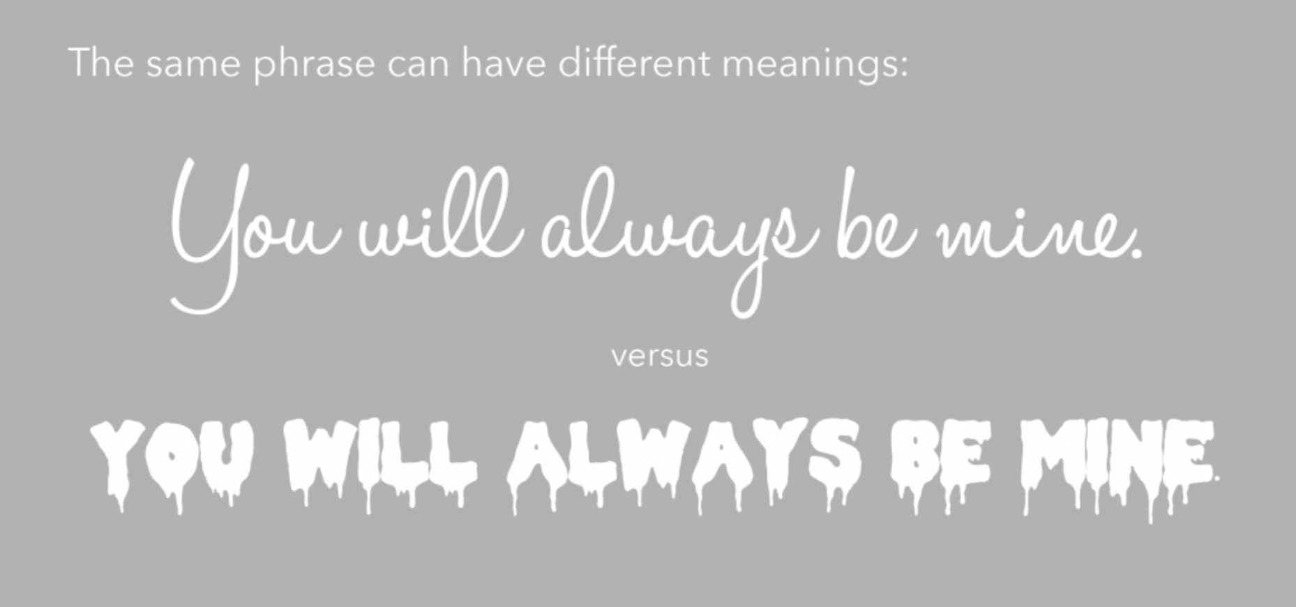
Because of the different font personalities, the same phrase can have different meanings depending on the fonts used to write them, so choose your fonts wisely!